Stretto
Stretto – Student Loan Relief Made Human
Overview
Stretto approached us with a clear and mission-driven goal: help everyday Americans better navigate the complex and often discouraging world of student loan forgiveness and relief programs. Backed by a partnership between Chase and Andrew, this project aimed to bridge the gap between eligibility and action with a modern, user-first platform.
Over the course of just two months, we designed a fully responsive web experience that included a conversion-optimized landing page, an intuitive multi-step wizard for discovering forgiveness options, and branded PDF cover sheets for offline form submission. Every element was designed with one thing in mind: make the process feel simple, approachable, and actionable—regardless of the user's background or familiarity with financial aid systems.
Building a Better Path to Forgiveness
Stretto approached us with a clear and mission-driven goal: help everyday Americans better navigate the complex and often discouraging world of student loan forgiveness and relief programs. Backed by a partnership between Chase and Andrew, this project aimed to bridge the gap between eligibility and action with a modern, user-first platform.
A Two-Month Design Sprint with Real Impact
Over the course of just two months, we designed a fully responsive web experience that included a conversion-optimized landing page, an intuitive multi-step wizard for discovering forgiveness options, and branded PDF cover sheets for offline form submission. Every element was designed with one thing in mind: make the process feel simple, approachable, and actionable—regardless of the user's background or familiarity with financial aid systems.

From Click to Clarity—Landing, Calculator & Wizard
We began by designing a landing page that focused on trust, transparency, and action. Featuring a student loan savings calculator, simplified explanations of the process, and clear pricing information, the homepage served as a high-converting entry point for visitors—many of whom were arriving with confusion, skepticism, or overwhelm.
From there, users moved into a step-by-step eligibility wizard built to feel more like a friendly guide than a government form. Each screen was structured to minimize cognitive load with microcopy, smart defaults, and progressive disclosure. Key steps included:
- Family Info: Clear dropdowns and short explanations about household size and dependents
- Employment Type: Fast identification of public service roles that may qualify for forgiveness
- Income Disclosure: Conditional branching to account for significant changes in income (past vs. current)
- NSLDS File Upload: A nudge with tooltips and support for downloading loan data from the official federal site
Every interaction was optimized for clarity—supporting those who might not understand acronyms, legal terminology, or even what kind of loans they had.


Guidance Through Completion & Offline Assets
At the end of the application process, users were provided with a clean and confidence-boosting confirmation screen that outlined clear next steps. A modal reinforced their progress, offered a checklist, and helped reduce anxiety about what happens next. This soft but strategic handoff helped ensure completion rates remained high, even in a partially offline system.
Because many forgiveness forms still require physical mail-in submission, we also designed custom PDF cover sheetsthat would be printed and included with documentation. These weren’t afterthoughts—they were branded, structured, and written to guide servicers through the paperwork while making sure nothing got lost or miscategorized.
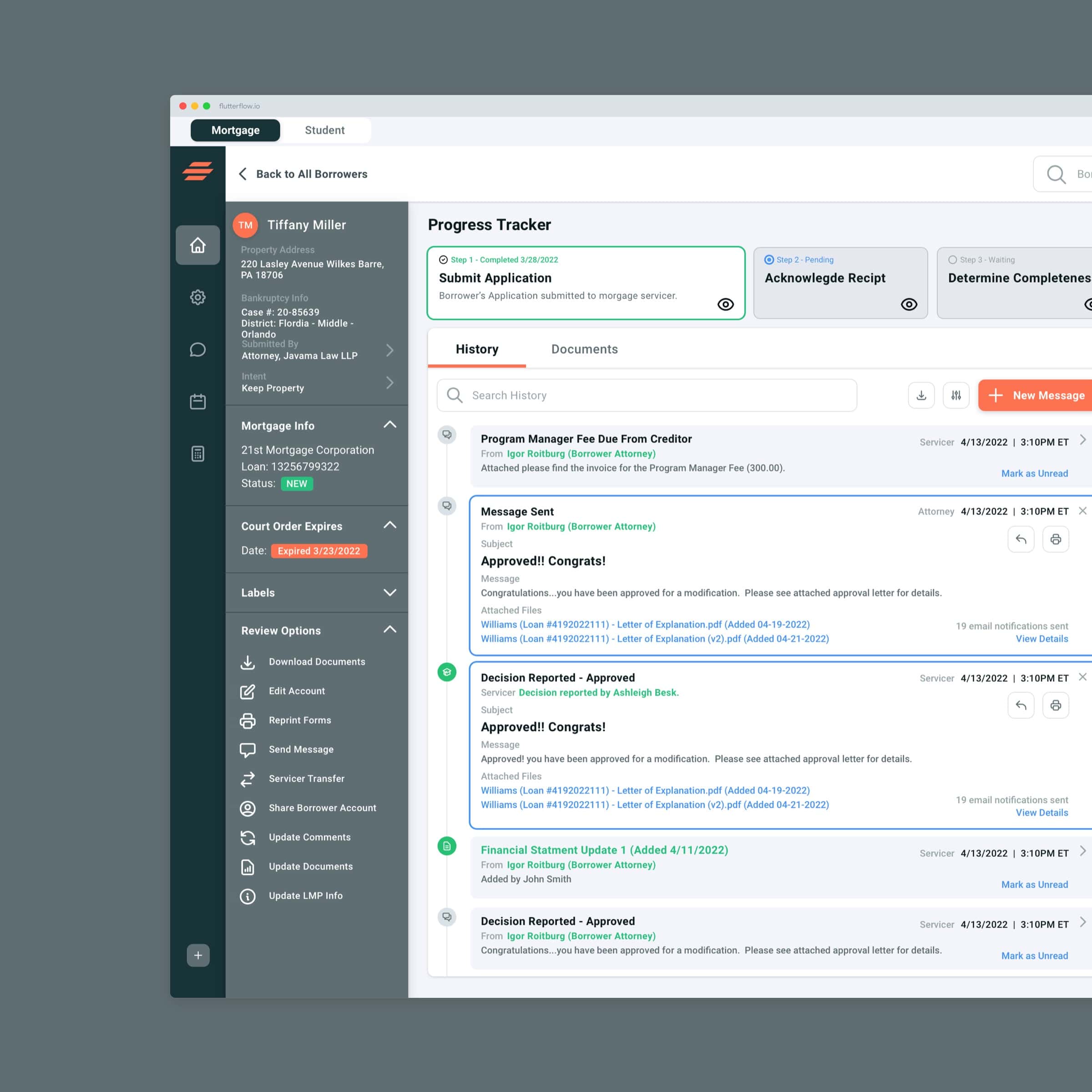
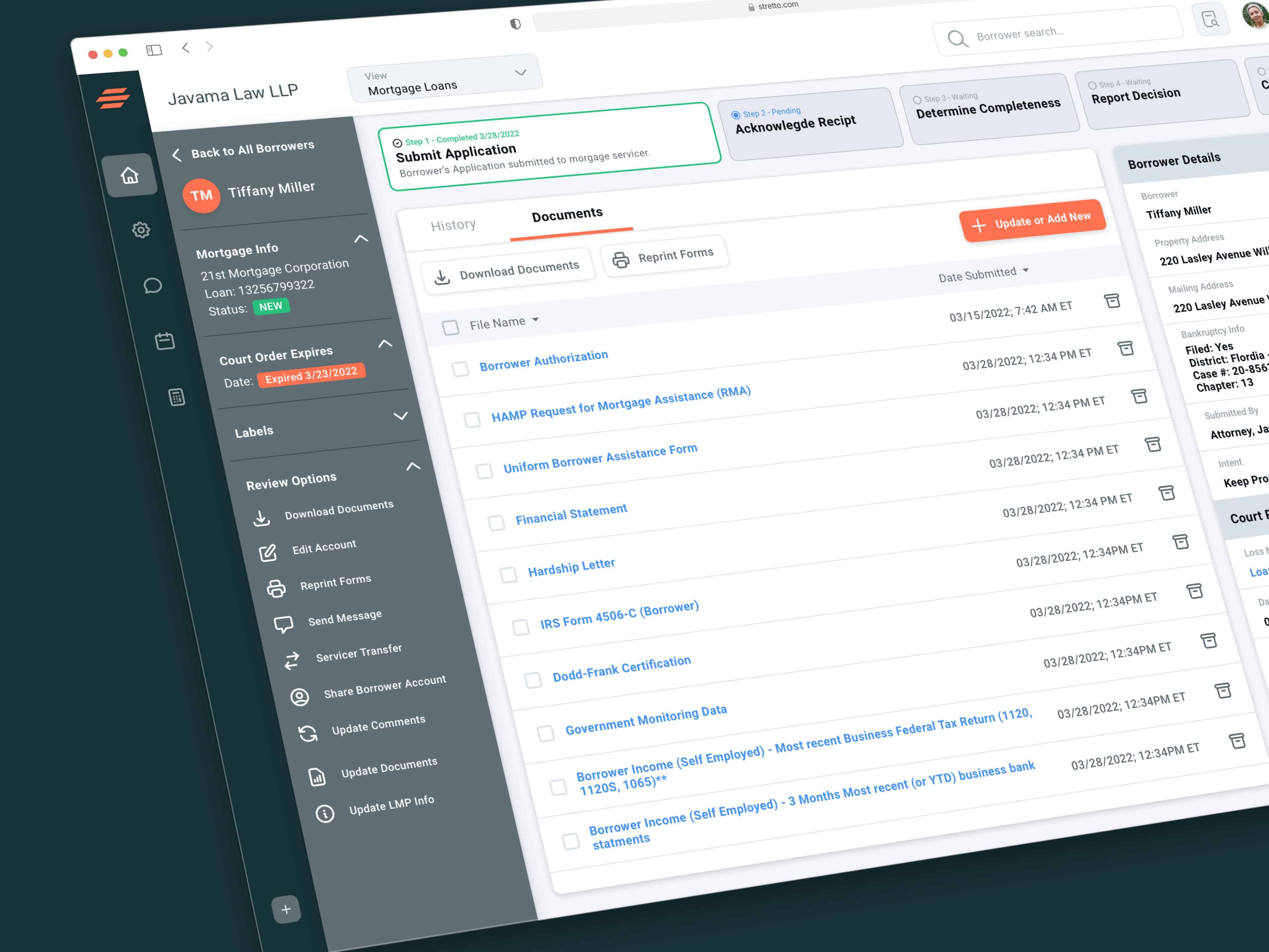
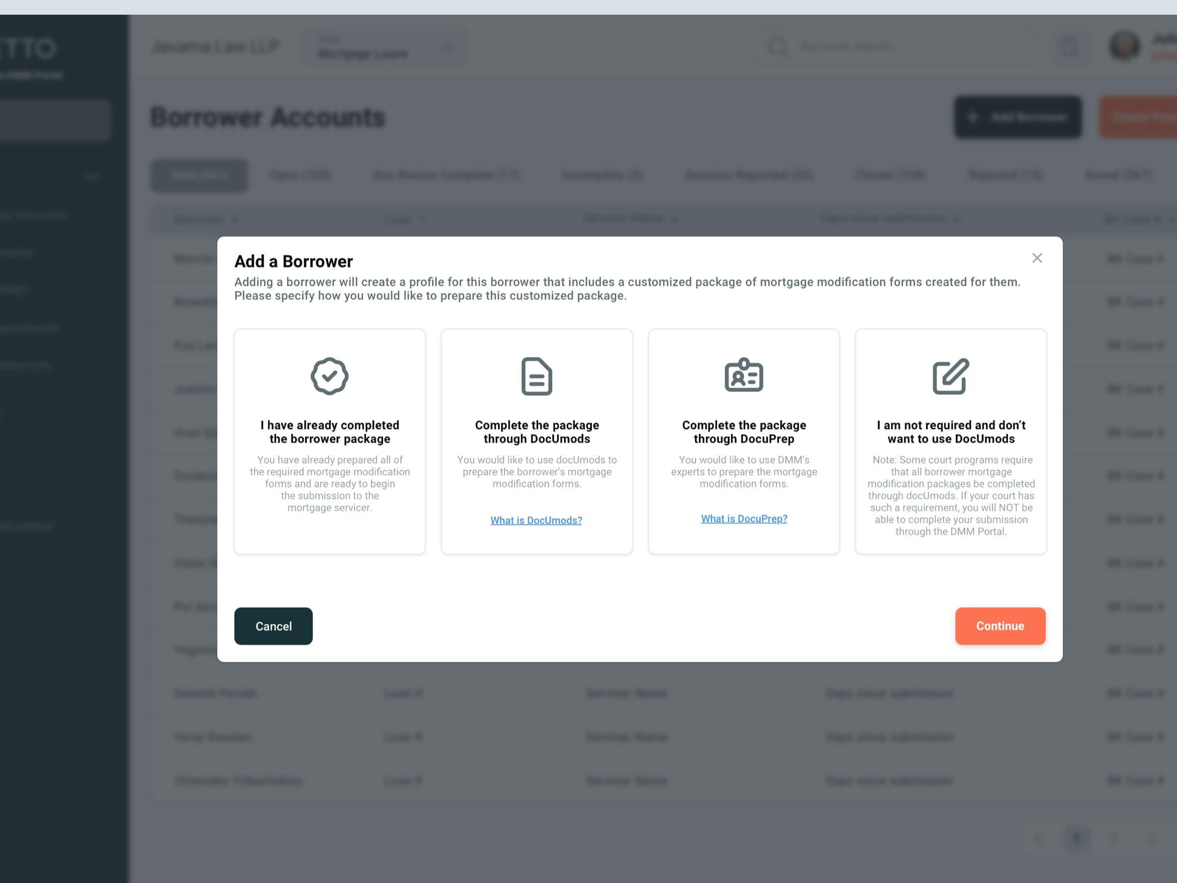
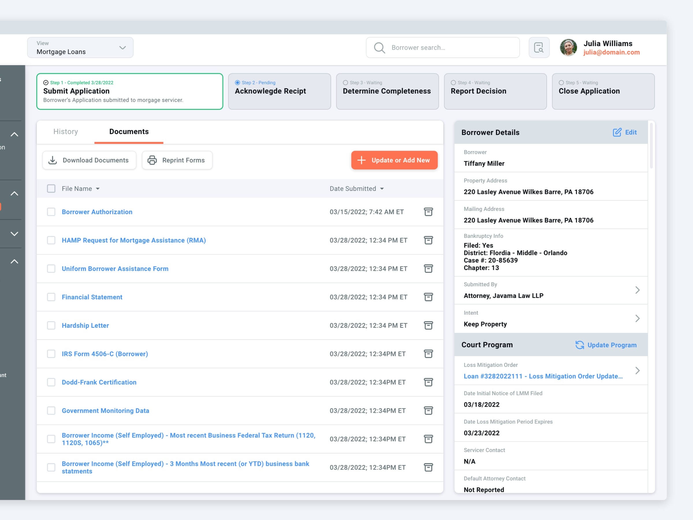
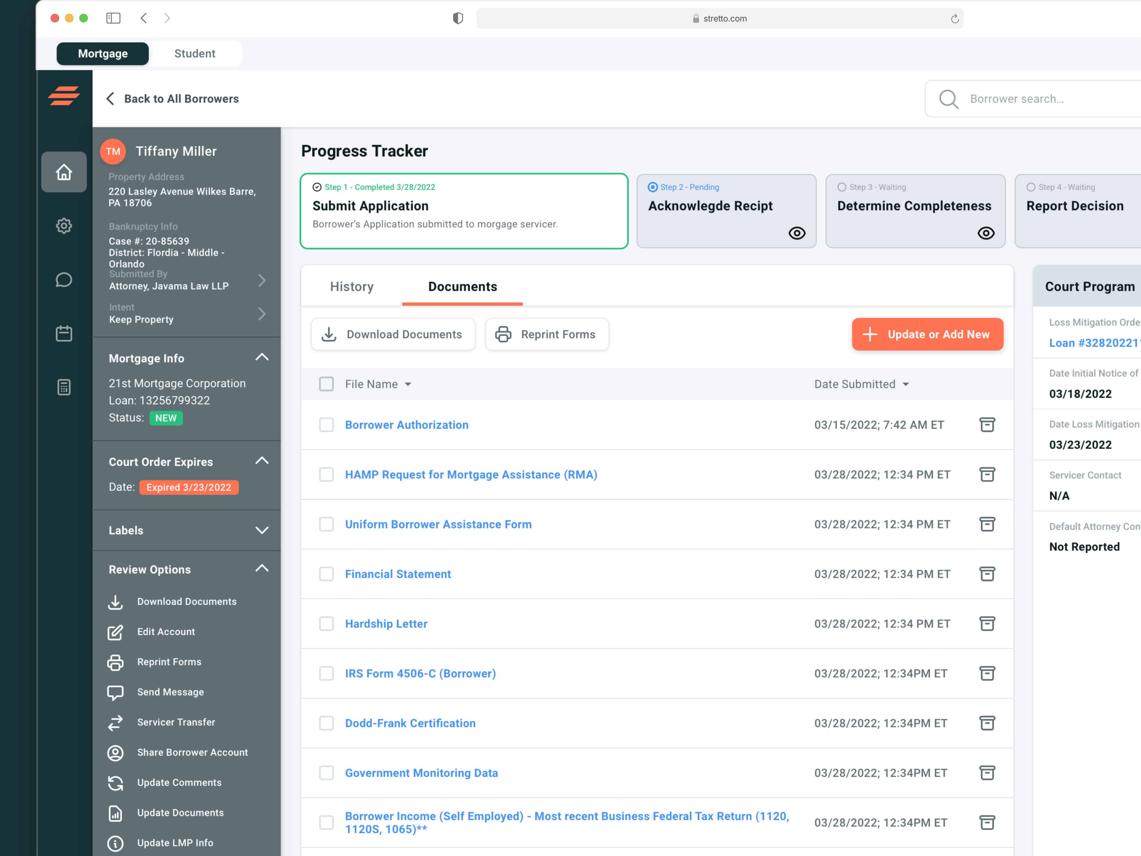
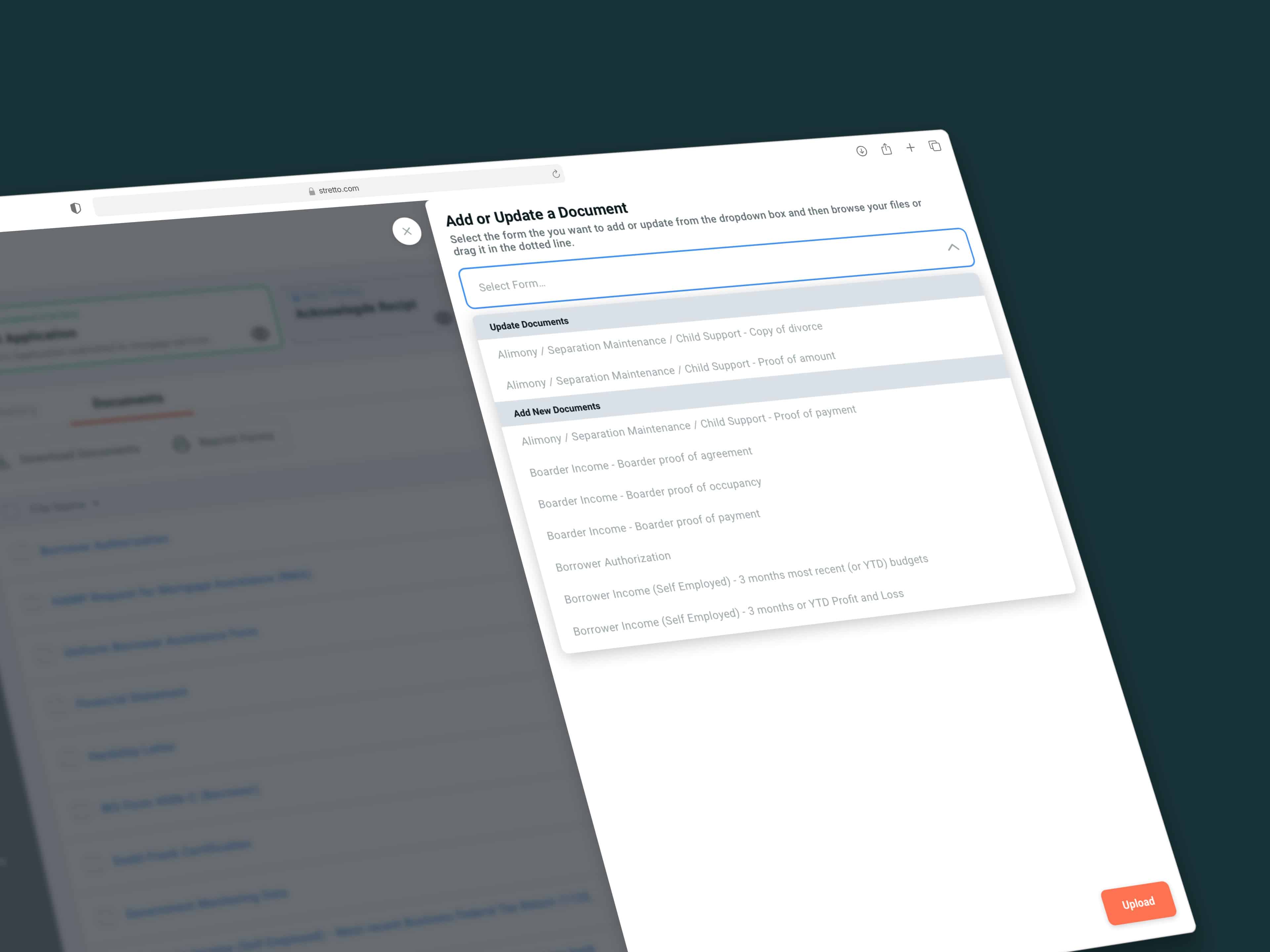
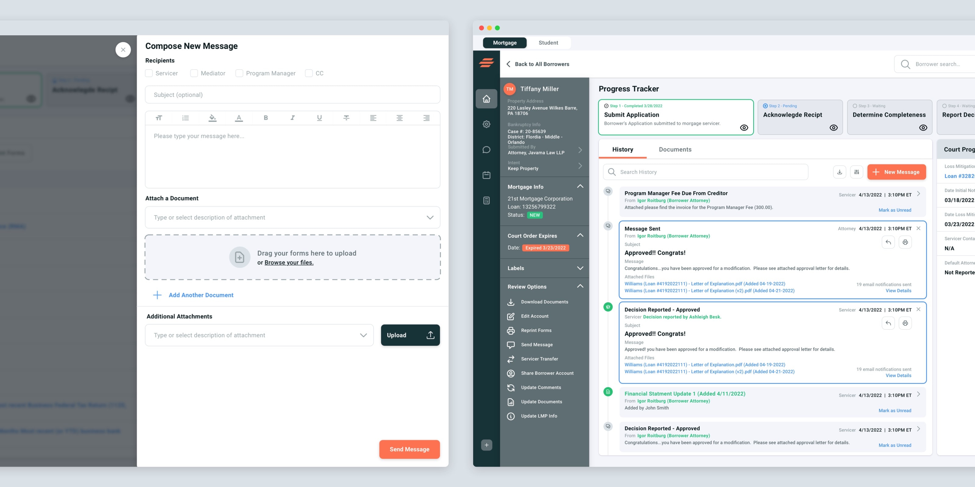
Solutions
We first dove in and worked on revamping the navigation in the main view of the app. We extracted the CTA's from the main navigation (they appeared as links before), and we combined them into one primary CTA in the top right. Guiding users to create borrowers from this single CTA instead of having it as a navigation link.
We came up with a solution where users could easily create new borrowers and manage existing ones, along with a refreshed look at the borrower details.
Conclusion
Our deliverable was to pass off the redesigned screens and establish a design system for the developers to implement, after establishing the design system the development team was allowed to cary through to other screens in the application.


Start a project


